Passa ai contenuti principali

Here Come The Most Stunning Base-Effect Charts Since The Great Depression

In just a few days, US high frequency economic data will lap March 2020 when the US economy literally shut down and sent all economic indicators in freefall to a degree not seen since the Great Depression (and in many cases, more).

When that happens, while March/April economic data will rise only modestly compared to the previous month, it will be a veritable explosion compared to the shutdown a year ago. This is the so-called "base effect" and while many economists will ignore it, especially when it comes to inflation data, the impact for many will be jarring especially when investors see charts that have gone, for lack of a better word, vertical.

To preview the annual change base effect that is coming in everything from retail sales, to income and spending, to housing data, to jobs and unemployment, we have pulled some of the most representative real-time indicators available from JPMorgan and Bank of America, starting with what is perhaps the most illustrative chart of all: JPM's spending tracker on the bank's own consumer (debit and credit) cards.

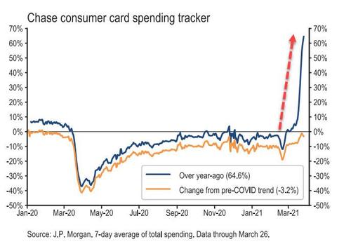
Here the 65% surge in spending is not because of an actual surge in spending March, but because spending last March imploded. Which is why to normalize for the post-March 2020 shock, banks will likely show not just the Y/Y chart, but also a chart comparing to 2-year ago or, better yet, a pre-covid blended trend as JPM has done in the chart above.

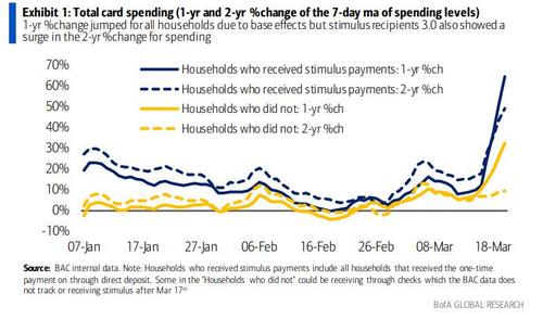
Bank of America published a similar chart, showing a huge jump in Y/Y card spending, especially among households who received stimulus payments - and this time on both a 1 and 2 year basis - while household that did not receive stimulus saw a roughly 30% jump in Y/Y spending due to the base effect, and only a modest increase in 2Y spending.

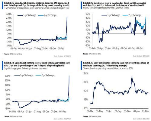
Here are some other charts showing how the 1-Year, but not 2-Year change, has gone vertical:
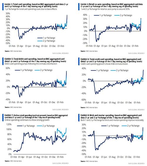
... And some more.

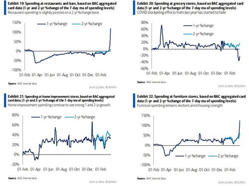
... And even more...

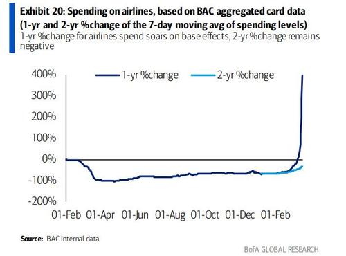
But nowhere is the base effect more visible than in the 1-year spending on airlines, where we see a very clear "lift off" formation in progress.

Commenti

Post popolari in questo blog

Fwd: The Looming Bank Collapse The U.S. financial system could be on the cusp of calamity. This time, we might not be able to save it.

After months  of living with the coronavirus pandemic, American citizens are well aware of the toll it has taken on the economy: broken supply chains, record unemployment, failing small businesses. All of these factors are serious and could mire the United States in a deep, prolonged recession. But there's another threat to the economy, too. It lurks on the balance sheets of the big banks, and it could be cataclysmic. Imagine if, in addition to all the uncertainty surrounding the pandemic, you woke up one morning to find that the financial sector had collapsed. You may think that such a crisis is unlikely, with memories of the 2008 crash still so fresh. But banks learned few lessons from that calamity, and new laws intended to keep them from taking on too much risk have failed to do so. As a result, we could be on the precipice of another crash, one different from 2008 less in kind than in degree. This one could be worse. John Lawrence: Inside the 2008 financial crash The financial...

Charting the World Economy: The U.S. Jobs Market Is On Fire - Bloomberg

Charting the World Economy: The U.S. Jobs Market Is On Fire - Bloomberg https://www.bloomberg.com/news/articles/2019-12-06/charting-the-world-economy-the-u-s-jobs-market-is-on-fire Charting the World Economy: The U.S. Jobs Market Is On Fire Zoe Schneeweiss Explore what's moving the global economy in the new season of the Stephanomics podcast. Subscribe via  Apple Podcast , Spotify or  Pocket Cast . The last U.S. payrolls report of the decade was a doozy, beating expectations and doing its bit to keep the consumer in good health heading into 2020. That's good news given the various pressures still weighing on global growth. Here's some of the charts that appeared on Bloomberg this week, offering a pictorial insight into the latest developments in the global economy. U.S. Advertisement Scroll to continue with content ...

The repo market is ‘broken’ and Fed injections are not a lasting solution, market pros warn

By Joy Wiltermuth Published: Dec 7, 2019 9:35 a.m. ET Banks prefer to keep money at Fed instead of lending to other banks Getty Images Examining $100 bills. Getty Images By Joy Wiltermuth Markets reporter The Federal Reserve's ongoing efforts to shore up the short-term "repo" lending markets have begun to rattle some market experts. The New York Federal Reserve has spent hundreds of billions of dollars to keep credit flowing through short term money markets since mid-September when a shortage of liquidity caused a spike in overnight borrowing rates. But as the Fed's interventions have entered a third month, concerns about the market's dependence on its daily doses of liquidity have grown. "The big picture answer is that the repo market is broken," said James Bianco, founder of Bianco R...