Without the Outliers, Inflation Is Running Hot. Fed Has Started Mentioning these Measures in the Minutes
Cleveland Fed's Underlying Inflation Measure Hits 3.0%, Hottest in the Data.
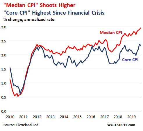
"Soft inflation?" The inflation measure by the Cleveland Fed — the "Median CPI," which is based on Consumer Price Index data but removes the outliers in the data to reveal underlying inflation trends — jumped 3.0% for September, the highest in the data series going back to the Financial Crisis, when this measure was launched.
By comparison, "core CPI," which removes food and energy prices, hit 2.4% in August and September, the highest since September 2008:
The Fed is mentioning these kinds of alternative inflation measures in the minutes of the FOMC meetings – voiced by "some participants" – to show that underlying trends in inflation are pointing upward, except for a few outliers, such as the re-collapse of oil prices and a few other items that skew the overall results, and to show that the "soft inflation readings during the earlier period were transitory."
The oil bust that started in mid-2014 did a job on overall inflation data. The price of oil plunged by over 70%. Crude oil is not only refined into transportation and heating fuels; it's also used as feedstock for the chemical industry. And that worked itself into the broader pricing data. In October last year, oil prices had recovered partially, with WTI trading in the range of $75 a barrel. But then oil prices collapsed again, and are now down 28% from a year ago.
Oil does this from time to time, as do agricultural commodities, and that is why inflation measures are offered in at least two versions: "All items" and "without food and energy." The all-items CPI in September rose a tame 1.7% from a year ago. But the CPI without food and energy("core CPI," the blue line in the chart above) jumped 2.4% — the fastest rate since September 2008.
Energy and agricultural commodities are not the only items that skew overall inflation readings. There are other items as well that – for reasons unrelated to inflation – more or less briefly spike or collapse, before reverting toward the mean. The moves are related to short-term market manias, supply crunches, supply gluts, sudden price wars, and other factors that are unrelated to the purchasing power of the dollar (which is what consumer price inflation measures).
After the turmoil of the Financial Crisis, the Cleveland Fed launched the "Median CPI" in the chart above to show underlying trends of inflation in consumer prices and to predict inflation trends over the medium time horizon.
The Median CPI tracks the mid-point (median) of the 45 CPI components, with a cumulative importance of near 50%:
- Above it are the components with the biggest price declines and the lowest price gains that combined weigh about 50% in the index.
- Below it are the components with the biggest price gains, weighing the remaining 50%.
The line in between marks the midpoint of CPI, hence the "Median CPI." This line in the middle came in at 3.0% annualized rate in September.
The table (via the Cleveland Fed) shows the 45 CPI components for September 2019, from the components with the largest price declines (at the top, motor fuel: -25.1%) to the components with the largest price gains (at the bottom, lodging away from home: +28.1%). The mid-point (the point closest to a cumulative weight of 50) is the "median CPI," and is marked in bold (if your smartphone clips one of the four columns, hold it in landscape position):
| Component | 1-Month Annualized % Change | Relative Importance % | Cumulative Relative Importance % |
| Motor Fuel | -25.1 | 3.6 | 3.6 |
| Women's and Girls' Apparel | -18.7 | 1.2 | 4.8 |
| Used Cars and Trucks | -17.9 | 2.3 | 7.1 |
| Fresh Fruits and Vegetables | -15.0 | 1.0 | 8.1 |
| Infants' and Toddlers' Apparel | -13.4 | 0.1 | 8.3 |
| Fuel Oil and Other Fuels | -12.6 | 0.2 | 8.4 |
| Miscellaneous Personal Goods | -12.1 | 0.2 | 8.6 |
| Watches and Jewelry | -11.9 | 0.2 | 8.9 |
| Medical Care Commodities | -6.9 | 1.7 | 10.6 |
| Personal Care Products | -3.2 | 0.7 | 11.2 |
| Alcoholic Beverages | -3.1 | 1.0 | 12.2 |
| Communication | -1.5 | 3.5 | 15.7 |
| Energy Services | -1.5 | 3.3 | 19.0 |
| New Vehicles | -1.5 | 3.7 | 22.7 |
| Footwear | -1.2 | 0.7 | 23.4 |
| Tenants' and Household Insurance | 0.1 | 0.4 | 23.8 |
| Recreation | 0.4 | 5.7 | 29.4 |
| Education | 0.7 | 3.1 | 32.5 |
| Personal Care Services | 1.2 | 0.6 | 33.1 |
| Nonalcoholic Beverages and Beverage Matls | 1.3 | 0.9 | 34.0 |
| Processed Fruits and Vegetables | 1.4 | 0.3 | 34.3 |
| Dairy and Related Products | 1.9 | 0.7 | 35.0 |
| Motor Vehicle Maintenance and Repair | 2.3 | 1.1 | 36.1 |
| Public Transportation | 2.5 | 1.1 | 37.3 |
| South: Owners' Equivalent Rent of Residences | 2.5 | 8.2 | 45.4 |
| Water/Sewer/Trash Collection Services | 2.7 | 1.1 | 46.5 |
| Misc Personal Services | 3.0 | 1.0 | 47.5 |
| Midwest: Owners' Equivalent Rent of Residences | 3.0 | 4.3 | 51.9 |
| Food Away From Home | 3.2 | 6.1 | 58.0 |
| Meats, Poultry, Fish and Eggs | 3.3 | 1.6 | 59.6 |
| Motor Vehicle Insurance | 3.3 | 2.4 | 61.9 |
| Northeast: Owners' Equivalent Rent of Residences | 3.4 | 5.1 | 67.1 |
| Household Furnishings and Operation | 3.5 | 4.3 | 71.3 |
| Other Food At Home | 3.7 | 1.8 | 73.2 |
| West: Owners' Equivalent Rent of Residences | 3.9 | 6.7 | 79.9 |
| Rent of Primary Residence | 4.3 | 8.1 | 87.9 |
| Leased Cars and Trucks | 4.4 | 0.6 | 88.6 |
| Medical Care Services | 4.5 | 7.1 | 95.7 |
| Cereals and Bakery Products | 5.7 | 1.0 | 96.6 |
| Car and Truck Rental | 6.9 | 0.1 | 96.8 |
| Tobacco and Smoking Products | 7.5 | 0.7 | 97.4 |
| Motor Vehicle Fees | 7.6 | 0.5 | 98.0 |
| Motor Vehicle Parts and Equipment | 8.0 | 0.4 | 98.4 |
| Men's and Boys' Apparel | 25.5 | 0.7 | 99.1 |
| Lodging Away From Home | 28.1 | 0.9 | 100.0 |
As you can see, some prices surge and other prices plunge, and many prices move up and down in smaller increments. Part of those moves are due to temporary factors. CPI is a weighted average of these moves and is skewed by outliers. Over the long term, the moves by these outliers wash out as they revert, but over the median term, they distort CPI.
That's the reason why CPI is so volatile though the actual loss of the purchasing power of the dollar over time is on a fairly steady trend.
The Cleveland Fed attempts to show the loss of the purchasing power of the dollar over the medium term, not influenced by the outliers. And based on this measure, the inflation trend is heating up. And "some participants" at the FOMC have started to point this out.
Commenti
Posta un commento